B2B | SaaS | 2023
B2B | SaaS | 2023
Replacing a Four-Year Old
Email Editor Tool
After four years on Beefree's editor, CleverTap needed something of its own. The result: a purpose-built, canvas-first email creation experience that unlocks creative freedom for 2,000+ marketers worldwide.
End to end design
User research
Stakeholder alignment
Jan – Aug 2023
Before we begin, go fullscreen for the best read
MY ROLE
End to end design
User research
TEAM
1 Product Designer (Me)
1 Product Manager
2 Customer Success Managers
3 Engineers
STAKEHOLDERS
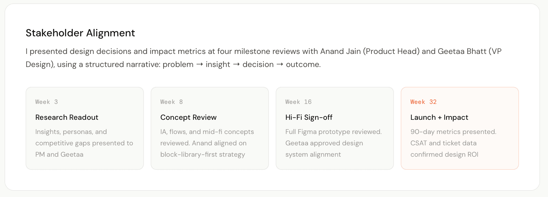
VP Design
Product Head
STATUS
Beta Released · Aug 2023
- OVERVIEW -
Context & Scope
Context & Scope
CleverTap powers retention for 2,000+ brands globally. But for four years, every email campaign ran through a Beefree plugin, a third-party iframe we embedded and shipped as our own. And it was holding our customers back.
PROBLEM
Faced rigid templates, a broken UX, and nearly $1.8M annually in licensing fees.
OPPORTUNITY
Competitors had invested in native editors, and our customers were noticing this shift and churning.
ROLE
End-to-end ownership, leading research, design, prototyping, and post-launch validation.
CONSTRAINTS
8 months, 3 engineers, and 15,000+ existing templates that couldn't be broken.
TARGET
8 beta customers for 90 days, cutting creation time from 45 to 20 minutes, raising CSAT from 3.2 to 4.0+, and achieving 30% feature adoption in 30 days.
Approach
Canvas-first and block-based, with every decision traced back to real customer research.
- problem -
What Was Holding
Our Customers Back
What Was Holding
Our Customers Back
The Beefree integration was a stopgap, functional but fundamentally limiting. As our customers' expectations grew, the gap between what they needed and what Beefree could offer became impossible to ignore.

Rigid Block System
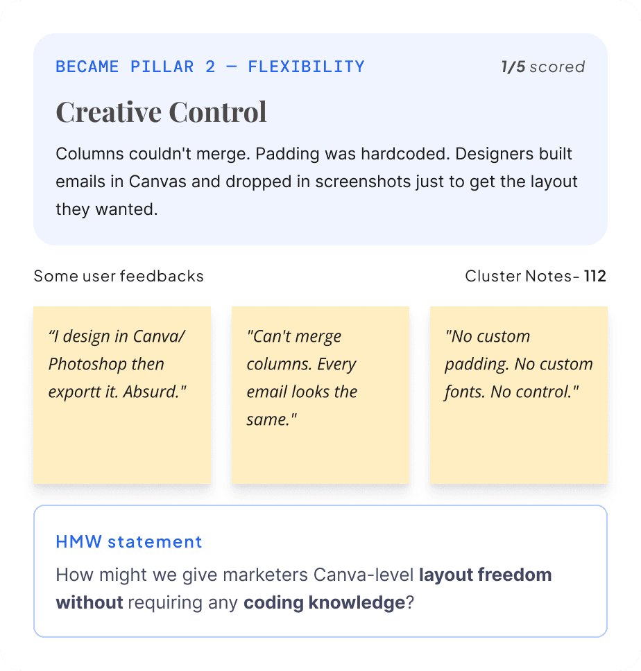
Fixed blocks. No custom layouts. Every email looked identical.

Broken Context Switching
Opening the editor felt like leaving the product. Different fonts, different controls, different everything.

Performance Issues
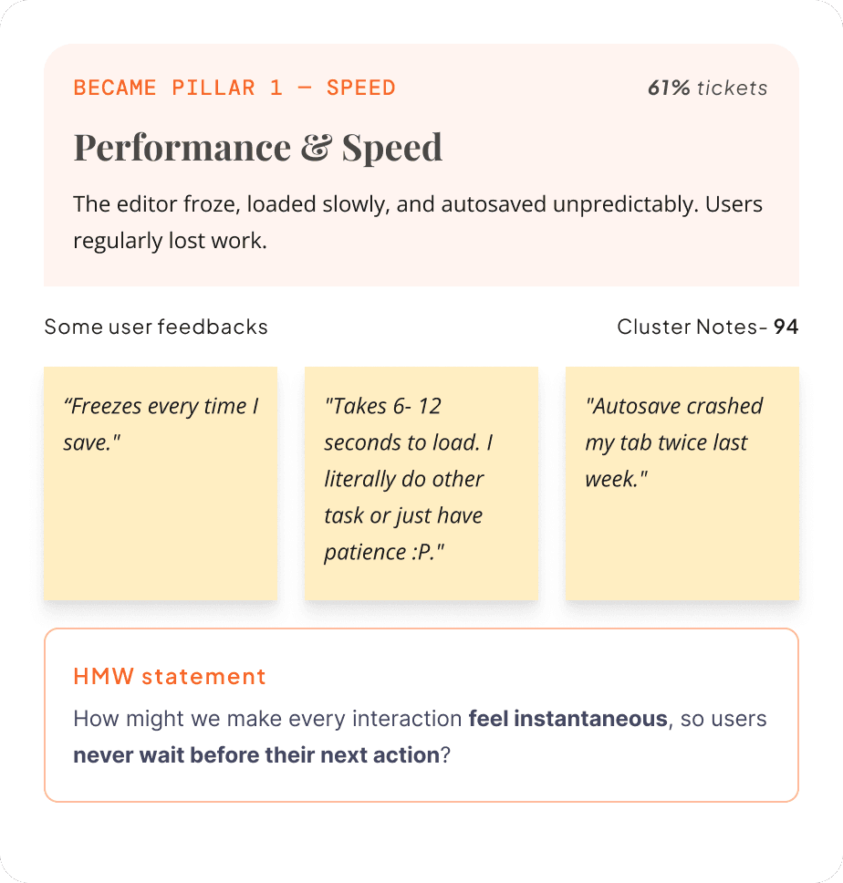
6.2 seconds to load. Autosave froze the UI. Mobile preview needed a full page reload
every time.

No Reusability
No saved blocks. No brand kit. Every template
built from scratch, every single time.

Licensing Cost & Lock-in
A tool we couldn't control which was costing
us ~$1.8M/year and growing.
"I have a vision for how this email should look, but the editor just won’t let me do it. I end up building half of it in Figma, screenshotting it, and dropping in an image."
Marketing Lead
E-commerce customer (13K MAU)
"Every time I switch to the email editor it feels like I’m leaving CleverTap. The UI completely changes: fonts, colors, behavior. It breaks my flow every single time."
Growth Manager
Fintech brand (8K MAU)
"I spend more time fighting the editor than writing the actual email. That can’t be right."
CRM Manager
E-commerce · 2.4M MAU
"Our designer refuses to use CleverTap for email. She exports from Figma and drops in an image. We've just accepted it."
Head of Marketing
Fintech · 180K users
"We moved 40% of our email campaigns to Klaviyo because their editor actually works the way we think. We kept CleverTap for push and in-app."
CRM Manager
CRM Director, retail brand (ARPU $140K/year)
"The moment I click into the email editor it feels like I'm in a different product from 2015. Everything else in CleverTap feels modern."
Growth Lead
Travel brand · 900K MAU
"We switched our promotional emails to Klaviyo six months ago. We only kept CleverTap for push. The editor was the reason."
CRM Director
Retail · $140K ARR
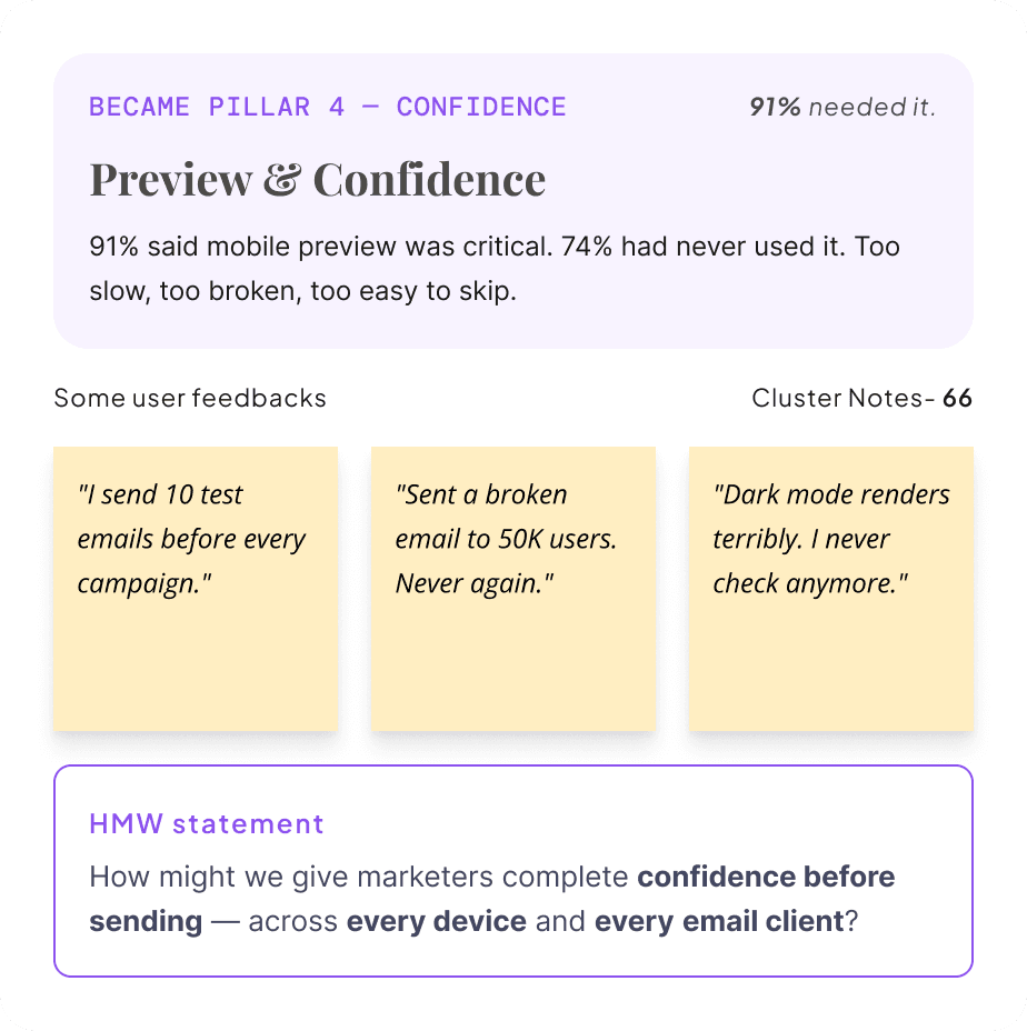
"I sent a broken email to 80,000 users last quarter because I couldn't preview it properly on mobile before sending."
Email Marketer
Media company · 80K subscribers
"Every Monday I rebuild the same header and footer. I've done it maybe 200 times now. There's no way to save it."
Marketing Executive
SaaS · 45K users
"Loading the editor is the longest part of my workflow. I make a coffee and come back."
Performance Marketer
Gaming · 3.1M MAU
"Our brand guidelines say one thing. The editor only lets me do another. So our emails never look on-brand."
Marketing Designer
Consumer app · 620K users
"I stopped checking dark mode because it takes too long. I just hope it looks okay on my users' phones."
Retention Specialist
Food delivery · 1.2M MAU
"We evaluated moving to Braze just because of the email editor. The rest of CleverTap is great, this one thing was that painful."
VP Marketing
Enterprise SaaS · $280K ARR
01- DISCOVERY & RESEARCH
How I Learned
What Was Broken
Assumptions weren't an option, but the timeline didn't allow for sequential research. So I ran four methods in parallel over two weeks, each one filling a gap the others couldn't.
01 · USER INTERVIEWS
What They Felt
All participants faced major obstacles.
The main issue: marketers no longer trusted the editor to work.
As a result, they created workarounds using Figma, Canva, and screenshots.
Marketers were almost defensive about these alternative solutions.
Segments: 4 enterprise (>$100K ARR)·6 mid-market · 4 SMB.CS team nominations.
02 · MARKET SURVEY
What Numbers Said
91% of users say mobile preview is critical.
78% rebuild the same elements each week.
Over half have switched to a competitor.
The editor scored 3.2 out of 5.
Average completion: 6.2 minNPS on email feature: 18 (below company avg. of 42)
03 · COMPETITIVE ANALYSIS
Where We Stood
CleverTap ranked last among competitors in the editor.
Competitors offered native block libraries with layout variants.
CleverTap relied on a third-party iframe to load customers.
6 tools tested12 tasks3-day sprintFramework: Jobs-to-be-Done
04 · SUPPORT TICKET MINING
What Product Showed
340 support tickets in 6 months.
61% of complaints were about layout and speed.
The editor was repeatedly called the slowest and most inflexible part of CleverTap.
340 tickets reviewed
6 months of data
Tagged by theme
Cross-checked with CS team
02- PATTERN SYNTHESIS
From Data to Direction
I had hundreds of raw data points. The synthesis sprint with team compressed them into 4 actionable pillars, and each pillar became a screen.

The Rest of the Picture
Three more signals that made the case impossible to ignore.
Three more signals that made the case impossible to ignore.
54%
Had used a competitor
More than half had already switched to Klaviyo or Mailchimp for email. They kept CleverTap for everything else.
3.2
Email editor CSAT
Out of 5. CleverTap's overall product CSAT was 4.1. The editor was pulling the whole platform down.
45m
Avg template creation time
Benchmarked via session recordings. Klaviyo averaged 11 minutes for the same task. The gap was the opportunity.
Who We Were
Designing For
Research revealed three distinct mental models of email creation, each with different goals, workflows, and frustrations. We designed for all three, but optimised the core experience for the Growth Marketer.

The growth marketer
Primary Persona · 62% of users
Goal: Launch campaigns fast. Needs pre-built blocks and smart templates they can personalise quickly.
Frustration: "I waste 40 minutes every time just getting a basic promo email to look the way I want."

The brand designer
Secondary Persona · 23% of users
Goal: Pixel-perfect brand consistency. Needs fine-grained control over spacing, typography, and custom CSS access.
Frustration: "Beefree won't let me do what Canva can. So I build in Canva, export PNG, upload. It's absurd."

The CRM Strategist
Tertiary Persona · 15% of users
Goal: Manage large template libraries for multiple brands. Needs role-based access, versioning, and team collaboration.
Frustration: "We have 400+ templates and no way to keep them consistent across brands without rebuilding everything."
What the Journey
Actually Looked Like
14 sessions of watching marketers build a real email, start to send. The result was a journey shaped less by features and more by frustration, with a clear emotional low point that defined what we had to fix first.

View
03 · BRIDGE PHASE
Before I Opened Figma
Four core problems came out of the research. Each one needed a design decision before any pixels were drawn. Here’s what I committed to, and why.

Structuring the Experience
I mapped the full experience architecture, how users navigate through the editor, how blocks are organised, and what states every screen needs to handle. This work in FigJam directly informed the hi-fi screens.


04 · HIGH-FIDELITY DESIGN
The Designed Experience
Four research pillars became seven end to end flows and 40 screens: the four core screens, plus AI Assist, AMP blocks and legacy migration. Everything runs on one token system with light and dark modes. Every interaction was prototyped in Figma and validated with usability participants before engineering handoff.
Explore the interactive prototype
Three Decisions That Shaped the Gallery
Beyond the visual design, the Template Gallery was shaped by three deliberate UX decisions, each grounded in research and protecting the marketer’s time. Click any card to see the UI variations explored.

TEMPLATE GALLERY: Before & after
SCREEN 02 · EMAIL CANVAS EDITOR
The core editing experience. A three-panel layout: block library on the left, live canvas in the centre, contextual properties on the right. Real-time changes render instantly in the preview.

SCREEN 03 · LIVE PREVIEW MODE
Real-time preview across device sizes: desktop, mobile, and dark mode, rendered without page reload. One of the most requested features and a key differentiator from Beefree.

SCREEN 04 · BRAND KIT
A centralised brand identity hub. Upload logo, define colour palette, set typography, and store reusable content snippets. One brand kit syncs across all templates, ensuring consistency at scale.

SCREEN 05 · AI ASSIST
Scoped to the selected block, or to a short brief for a full first draft. AI writes in the Brand Kit voice, the marketer keeps or undoes every change, and guardrails stop it from inventing offers. Nothing sends on its own.
SCREEN 06 · AMP BLOCKS
Carousels, polls and live countdowns without code. Every AMP block ships with an editable HTML fallback for clients that do not support AMP, and the editor flags sender registration before it turns into a failed send.
SCREEN 07 · LEGACY MIGRATION
More than 15,000 Beefree templates could not break. Templates convert automatically, a report shows what needs a look, marketers fix issues in place on the canvas, and the CRM team migrates in batches while live campaigns keep sending.
ONE SYSTEM BEHIND EVERY SCREEN
35 components and one token set with light and dark modes. The dark mode preview runs on the same tokens, so what marketers see is what ships. Drag and drop follows clear rules: the editor only blocks what would actually break an email, explains why in plain language, and warns instead of blocking when a drop is risky but valid.
05 · VALIDATION & TESTING
Proving It Before
We Shipped
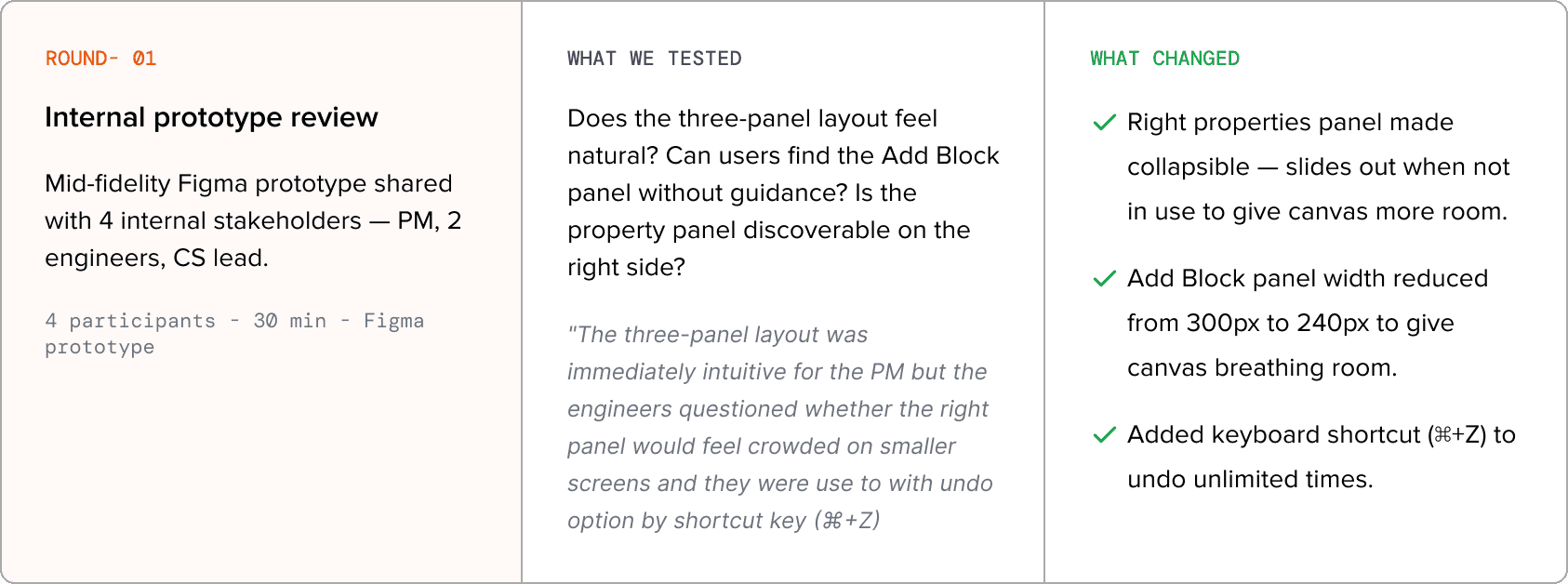
Before a single component was handed to engineering, there was need of documented proof that the designs worked: not opinion, not instinct. Four significant and six minor design changes came directly out of testing sessions. Each one required sign-off from the PM, Engineering Lead, and VP Design before we proceeded.



06 · THE HARD PARTS
What the Timeline
Doesn't Show
Not everything went to plan. The block taxonomy was rebuilt from scratch mid-project. The Brand Kit was in the wrong place until testing proved it. Two AMP blocks shipped with gaps we only caught in beta. And a PM disagreement nearly pushed to recreate the Editor layout. This section documents what broke, what we argued about, and what we changed.
WHAT WENT WRONG

ENGINEERING CONSTRAINTS: WHAT EMAIL HTML FORCED US TO ACCEPT
Not concepts: these are the actual interaction patterns that changed. The before state is what Beefree gave us. The after is what we shipped.

INTERNAL CHALLENGES: WHAT NEARLY DERAILED THE PROJECT
Not concepts: these are the actual interaction patterns that changed. The before state is what Beefree gave us. The after is what we shipped.

DETAILED METRICS: 90 DAYS POST-LAUNCH

07 · BUSINESS IMPACT
What Changed
After Launch
Measured over 90 days post-launch, August to November 2023. Data from Mixpanel, Zendesk, and quarterly CSAT surveys.
-73% Faster Template creation
Average time to complete a polished email template dropped from 45 minutes to 12 minutes. Measured via session recording analysis across a sample of 200 sessions pre and post-launch.
Baseline: 45 min→ Now: 12 min
4.6/5 Email Editor CSAT
Customer satisfaction for the email editor increased from 3.2 to 4.6 out of 5, a 44% uplift, measured via in-product survey.
Was: 3.2/5
−40% Support Ticket Reduction
Email-related support tickets dropped by 40% within 60 days of launch, freeing significant CS team capacity.
Was: ~340 tickets/6 months
68% Advanced Feature Adoption
68% of beta customers used at least one advanced feature (Brand Kit, Saved Blocks, AI Assist) within the first 30 days, far exceeding the 30% target.
Target was: 30%
$1.8M Annual Licensing Savings
Eliminating Beefree’s per-seat licensing model saved approximately $1.8M per year, directly contributing to EBITDA improvement.
Beefree cost: ~$1.8M/yr
+31%
Campaign Creation Rate
Email campaign creation rate increased by 31% in the first quarter post-launch, as marketers who previously avoided the tool returned to it.
Baseline: tracked via Mixpanel
08 · REFLECTIONS
What I'd Do Differently
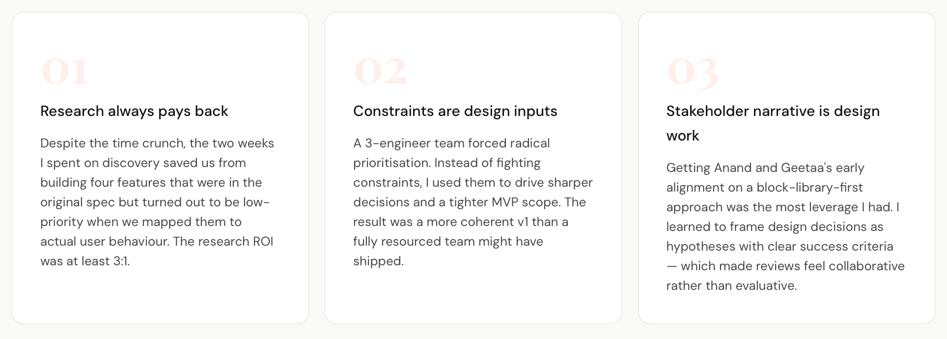
Eight months. One product surface rebuilt from scratch. Three things I'd approach differently if I started again.

- OVERVIEW -
Context & Scope
CleverTap powers retention for 2,000+ brands globally. But for four years, every email campaign ran through a Beefree plugin, a third-party iframe we embedded and shipped as our own. And it was holding our customers back.
PROBLEM
Faced rigid templates, a broken UX, and nearly $1.8M annually in licensing fees.
OPPORTUNITY
Competitors had invested in native editors, and our customers were noticing this shift and churning.
ROLE
End-to-end ownership, leading research, design, prototyping, and post-launch validation.
CONSTRAINTS
8 months, 3 engineers, and 15,000+ existing templates that couldn't be broken.
TARGET
8 beta customers for 90 days, cutting creation time from 45 to 20 minutes, raising CSAT from 3.2 to 4.0+, and achieving 30% feature adoption in 30 days.
Approach
Canvas-first and block-based, with every decision traced back to real customer research.
- problem -
What Was Holding
Our Customers Back
The Beefree integration was a stopgap, functional but fundamentally limiting. As our customers' expectations grew, the gap between what they needed and what Beefree could offer became impossible to ignore.
Rigid Block System
Fixed blocks. No custom layouts. Every email looked identical.
Broken Context Switching
Opening the editor felt like leaving the product. Different fonts, different controls, different everything.
Performance Issues
6.2 seconds to load. Autosave froze the UI. Mobile preview needed a full page reload
every time.
No Reusability
No saved blocks. No brand kit. Every template
built from scratch, every single time.
Licensing Cost & Lock-in
A tool we couldn't control which was costing
us ~$1.8M/year and growing.
"I have a vision for how this email should look, but the editor just won’t let me do it. I end up building half of it in Figma, screenshotting it, and dropping in an image."
Marketing Lead
E-commerce customer (13K MAU)
"Every time I switch to the email editor it feels like I’m leaving CleverTap. The UI completely changes: fonts, colors, behavior. It breaks my flow every single time."
Growth Manager
Fintech brand (8K MAU)
"I spend more time fighting the editor than writing the actual email. That can’t be right."
CRM Manager
E-commerce · 2.4M MAU
"Our designer refuses to use CleverTap for email. She exports from Figma and drops in an image. We've just accepted it."
Head of Marketing
Fintech · 180K users
"We moved 40% of our email campaigns to Klaviyo because their editor actually works the way we think. We kept CleverTap for push and in-app."
CRM Manager
CRM Director, retail brand (ARPU $140K/year)
"The moment I click into the email editor it feels like I'm in a different product from 2015. Everything else in CleverTap feels modern."
Growth Lead
Travel brand · 900K MAU
"We switched our promotional emails to Klaviyo six months ago. We only kept CleverTap for push. The editor was the reason."
CRM Director
Retail · $140K ARR
"I sent a broken email to 80,000 users last quarter because I couldn't preview it properly on mobile before sending."
Email Marketer
Media company · 80K subscribers
"Every Monday I rebuild the same header and footer. I've done it maybe 200 times now. There's no way to save it."
Marketing Executive
SaaS · 45K users
"Loading the editor is the longest part of my workflow. I make a coffee and come back."
Performance Marketer
Gaming · 3.1M MAU
"Our brand guidelines say one thing. The editor only lets me do another. So our emails never look on-brand."
Marketing Designer
Consumer app · 620K users
"I stopped checking dark mode because it takes too long. I just hope it looks okay on my users' phones."
Retention Specialist
Food delivery · 1.2M MAU
"We evaluated moving to Braze just because of the email editor. The rest of CleverTap is great, this one thing was that painful."
VP Marketing
Enterprise SaaS · $280K ARR
01- DISCOVERY & RESEARCH
How I Learned
What Was Broken
Assumptions weren't an option, but the timeline didn't allow for sequential research. So I ran four methods in parallel over two weeks, each one filling a gap the others couldn't.
01 · USER INTERVIEWS
What They Felt
All participants faced major obstacles.
The main issue: marketers no longer trusted the editor to work.
As a result, they created workarounds using Figma, Canva, and screenshots.
Marketers were almost defensive about these alternative solutions.
Segments: 4 enterprise (>$100K ARR)·6 mid-market · 4 SMB.CS team nominations.
02 · MARKET SURVEY
What Numbers Said
91% of users say mobile preview is critical.
78% rebuild the same elements each week.
Over half have switched to a competitor.
The editor scored 3.2 out of 5.
Average completion: 6.2 minNPS on email feature: 18 (below company avg. of 42)
03 · COMPETITIVE ANALYSIS
Where We Stood
CleverTap ranked last among competitors in the editor.
Competitors offered native block libraries with layout variants.
CleverTap relied on a third-party iframe to load customers.
6 tools tested12 tasks3-day sprintFramework: Jobs-to-be-Done
04 · SUPPORT TICKET MINING
What Product Showed
340 support tickets in 6 months.
61% of complaints were about layout and speed.
The editor was repeatedly called the slowest and most inflexible part of CleverTap.
340 tickets reviewed
6 months of data
Tagged by theme
Cross-checked with CS team
02- PATTERN SYNTHESIS
From Data to Direction
I had hundreds of raw data points. The synthesis sprint with team compressed them into 4 actionable pillars, and each pillar became a screen.
The Rest of the Picture
Three more signals that made the case impossible to ignore.
54%
Had used a competitor
More than half had already switched to Klaviyo or Mailchimp for email. They kept CleverTap for everything else.
3.2
Email editor CSAT
Out of 5. CleverTap's overall product CSAT was 4.1. The editor was pulling the whole platform down.
45m
Avg template creation time
Benchmarked via session recordings. Klaviyo averaged 11 minutes for the same task. The gap was the opportunity.
Who We Were
Designing For
Research revealed three distinct mental models of email creation, each with different goals, workflows, and frustrations. We designed for all three, but optimised the core experience for the Growth Marketer.
The growth marketer
Primary Persona · 62% of users
Goal: Launch campaigns fast. Needs pre-built blocks and smart templates they can personalise quickly.
Frustration: "I waste 40 minutes every time just getting a basic promo email to look the way I want."
The brand designer
Secondary Persona · 23% of users
Goal: Pixel-perfect brand consistency. Needs fine-grained control over spacing, typography, and custom CSS access.
Frustration: "Beefree won't let me do what Canva can. So I build in Canva, export PNG, upload. It's absurd."
The CRM Strategist
Tertiary Persona · 15% of users
Goal: Manage large template libraries for multiple brands. Needs role-based access, versioning, and team collaboration.
Frustration: "We have 400+ templates and no way to keep them consistent across brands without rebuilding everything."
What the Journey
Actually Looked Like
14 sessions of watching marketers build a real email, start to send. The result was a journey shaped less by features and more by frustration, with a clear emotional low point that defined what we had to fix first.
View
03 · BRIDGE PHASE
Before I Opened Figma
Four core problems came out of the research. Each one needed a design decision before any pixels were drawn. Here’s what I committed to, and why.
Structuring the Experience
I mapped the full experience architecture, how users navigate through the editor, how blocks are organised, and what states every screen needs to handle. This work in FigJam directly informed the hi-fi screens.
04 · HIGH-FIDELITY DESIGN
The Designed Experience
Four research pillars became seven end to end flows and 40 screens: the four core screens, plus AI Assist, AMP blocks and legacy migration. Everything runs on one token system with light and dark modes. Every interaction was prototyped in Figma and validated with usability participants before engineering handoff.
Explore the interactive prototype
Three Decisions That Shaped the Gallery
Beyond the visual design, the Template Gallery was shaped by three deliberate UX decisions, each grounded in research and protecting the marketer’s time. Click any card to see the UI variations explored.
TEMPLATE GALLERY: Before & after
SCREEN 02 · EMAIL CANVAS EDITOR
The core editing experience. A three-panel layout: block library on the left, live canvas in the centre, contextual properties on the right. Real-time changes render instantly in the preview.
SCREEN 03 · LIVE PREVIEW MODE
Real-time preview across device sizes: desktop, mobile, and dark mode, rendered without page reload. One of the most requested features and a key differentiator from Beefree.
SCREEN 04 · BRAND KIT
A centralised brand identity hub. Upload logo, define colour palette, set typography, and store reusable content snippets. One brand kit syncs across all templates, ensuring consistency at scale.
SCREEN 05 · AI ASSIST
Scoped to the selected block, or to a short brief for a full first draft. AI writes in the Brand Kit voice, the marketer keeps or undoes every change, and guardrails stop it from inventing offers. Nothing sends on its own.
SCREEN 06 · AMP BLOCKS
Carousels, polls and live countdowns without code. Every AMP block ships with an editable HTML fallback for clients that do not support AMP, and the editor flags sender registration before it turns into a failed send.
SCREEN 07 · LEGACY MIGRATION
More than 15,000 Beefree templates could not break. Templates convert automatically, a report shows what needs a look, marketers fix issues in place on the canvas, and the CRM team migrates in batches while live campaigns keep sending.
ONE SYSTEM BEHIND EVERY SCREEN
35 components and one token set with light and dark modes. The dark mode preview runs on the same tokens, so what marketers see is what ships. Drag and drop follows clear rules: the editor only blocks what would actually break an email, explains why in plain language, and warns instead of blocking when a drop is risky but valid.
05 · VALIDATION & TESTING
Proving It Before
We Shipped
Before a single component was handed to engineering, there was need of documented proof that the designs worked: not opinion, not instinct. Four significant and six minor design changes came directly out of testing sessions. Each one required sign-off from the PM, Engineering Lead, and VP Design before we proceeded.
06 · THE HARD PARTS
What the Timeline
Doesn't Show
Not everything went to plan. The block taxonomy was rebuilt from scratch mid-project. The Brand Kit was in the wrong place until testing proved it. Two AMP blocks shipped with gaps we only caught in beta. And a PM disagreement nearly pushed to recreate the Editor layout. This section documents what broke, what we argued about, and what we changed.
WHAT WENT WRONG
ENGINEERING CONSTRAINTS: WHAT EMAIL HTML FORCED US TO ACCEPT
Not concepts: these are the actual interaction patterns that changed. The before state is what Beefree gave us. The after is what we shipped.
INTERNAL CHALLENGES: WHAT NEARLY DERAILED THE PROJECT
Not concepts: these are the actual interaction patterns that changed. The before state is what Beefree gave us. The after is what we shipped.
DETAILED METRICS: 90 DAYS POST-LAUNCH
07 · BUSINESS IMPACT
What Changed
After Launch
Measured over 90 days post-launch, August to November 2023. Data from Mixpanel, Zendesk, and quarterly CSAT surveys.
-73% Faster Template creation
Average time to complete a polished email template dropped from 45 minutes to 12 minutes. Measured via session recording analysis across a sample of 200 sessions pre and post-launch.
Baseline: 45 min→ Now: 12 min
4.6/5 Email Editor CSAT
Customer satisfaction for the email editor increased from 3.2 to 4.6 out of 5, a 44% uplift, measured via in-product survey.
Was: 3.2/5
−40% Support Ticket Reduction
Email-related support tickets dropped by 40% within 60 days of launch, freeing significant CS team capacity.
Was: ~340 tickets/6 months
68% Advanced Feature Adoption
68% of beta customers used at least one advanced feature (Brand Kit, Saved Blocks, AI Assist) within the first 30 days, far exceeding the 30% target.
Target was: 30%
$1.8M Annual Licensing Savings
Eliminating Beefree’s per-seat licensing model saved approximately $1.8M per year, directly contributing to EBITDA improvement.
Beefree cost: ~$1.8M/yr
+31%
Campaign Creation Rate
Email campaign creation rate increased by 31% in the first quarter post-launch, as marketers who previously avoided the tool returned to it.
Baseline: tracked via Mixpanel
08 · REFLECTIONS
What I'd Do Differently
Eight months. One product surface rebuilt from scratch. Three things I'd approach differently if I started again.
Thanks for reading this far
More case studies are on the way. If this resonated, I’d love to hear from you.


Thanks for reading this far
More case studies are on the way. If this resonated, I’d love to hear from you.