
Bringing Visual
Click Analytics to Email
A native click-density layer for CleverTap's email analytics,
shipped as a focused MVP.
End to end design
User research
Stakeholder alignment
Jan – Aug 2023

Before we begin, go fullscreen for the best read
MY ROLE
Senior Product Designer
TEAM
1 Product Designer (Me)
1 Product Manager
2 Customer Success Managers
3 Engineers
STAKEHOLDERS
VP Design
Product Head
STATUS
April 2024
Overview
CleverTap's email reports could tell marketers how many people clicked — open rates, click rates, totals. What they couldn't tell them was where. Marketers were optimising layouts on instinct, with no visual signal of which sections, blocks, or links were actually pulling engagement.
Click Map closed that gap. It added a visual click-density layer directly on top of the email preview, so a marketer could see at a glance which parts of a campaign were earning attention and which were being ignored — then act on it without leaving the analytics view.
This was a deliberately scoped MVP: one feature, a tight timeline, and a clear goal — prove that contextual click visualisation made email optimisation faster and more intuitive, then refine with real usage after launch.
PROBLEM
Marketers had no clarity on where users clicked inside their emails.
SOLUTION
A visual click-density layer on top of email analytics, surfacing click hotspots by section — shipped as an MVP.
OUTCOME
Marketers could read engagement visually and optimise content placement and strategy from a single view, instead of guessing from aggregate rates.
THE CHALLENGE
Five things made this harder than "just draw a heatmap on an email."
Visual clarity in dense layouts. The density overlay couldn't drown out the email it was sitting on top of. The signal had to stay readable without burying the content.
Cross-device consistency. Click behaviour differs sharply between mobile and desktop, so a single static view would mislead. The feature had to represent both honestly.
Real-time data sync. Surfacing click data on the right email version meant close backend collaboration and careful DOM mapping — getting the visualisation to line up with the structure it described.
Complex email structures. Custom HTML and nested tables — common in real campaigns — routinely broke naive overlay rendering.
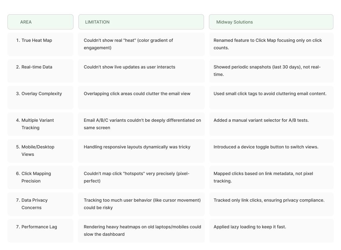
Technical limitation as a design constraint. Some of what a "true heatmap" implies simply wasn't feasible on the data we had. That reality shaped the product's direction and forced honest scoping decisions (covered in detail below).
Approach: Mixed-Methods, MVP-First
On a feature-level project with a tight timeline, full user validation isn't always realistic — and pretending otherwise would have been dishonest about how the work actually happened. I used a mixed-methods approach instead:
Benchmark against proven tools rather than re-deriving patterns marketers already understood.
Lean on established analytics conventions (heatmap colour logic, hover-for-detail, device toggles) so the feature felt familiar on day one.
Iterate quickly while still grounding every decision in evidence — competitor behaviour, heuristic principles, and the constraints engineering surfaced.
It's a conscious trade-off: depth vs. speed. For an MVP, the priority is validating the core idea quickly and refining with real users post-launch. The process ran in five stages:
01 Moodboarding → 02 Competitive Analysis → 03 Heuristic Evaluation → 04 Technical Limitation → 05 Iterative Design
Mood Boarding
Objective: establish a visual language and interaction style that made the click data easy to read, intuitive, and consistent with CleverTap's existing product design.

I explored five areas:
Gradient heat visualisations — warm-to-cool schemes (red = high engagement, blue = low), testing blur levels and opacity so the overlay never overwhelmed the email content beneath it.
Interaction cues — hover effects, tooltips, and click highlights, drawing on familiar patterns from analytics tools like Hotjar, Crazy Egg, and Mailchimp.
Email contextual overlays — how density should sit directly on the email preview while keeping the underlying content legible.
Device toggle interfaces — a mobile/desktop switch so marketers could compare behaviour across platforms from one screen.
Minimalist UI — clean, card-based layouts on neutral backgrounds, so the bold heat colours did the talking.
Design takeaways:
Chose blurred gradients with subtle transparency to preserve readability of the email beneath.
Used microinteractions (like hover indicators) for detail on demand, keeping the default view calm.
Used tabbed toggles to make the mobile/desktop switch intuitive.
Prioritised contrast control so the overlay never obscured text.
Competitive Analysis
🎯 Objective?
To understand how existing email marketing and analytics tools implement click heatmaps—what works, what doesn’t, and where Clevertap can innovate.
🔍 Tools Analyzed
Mailchimp
Hotjar
Crazy Egg
Campaign Monitor
HubSpot


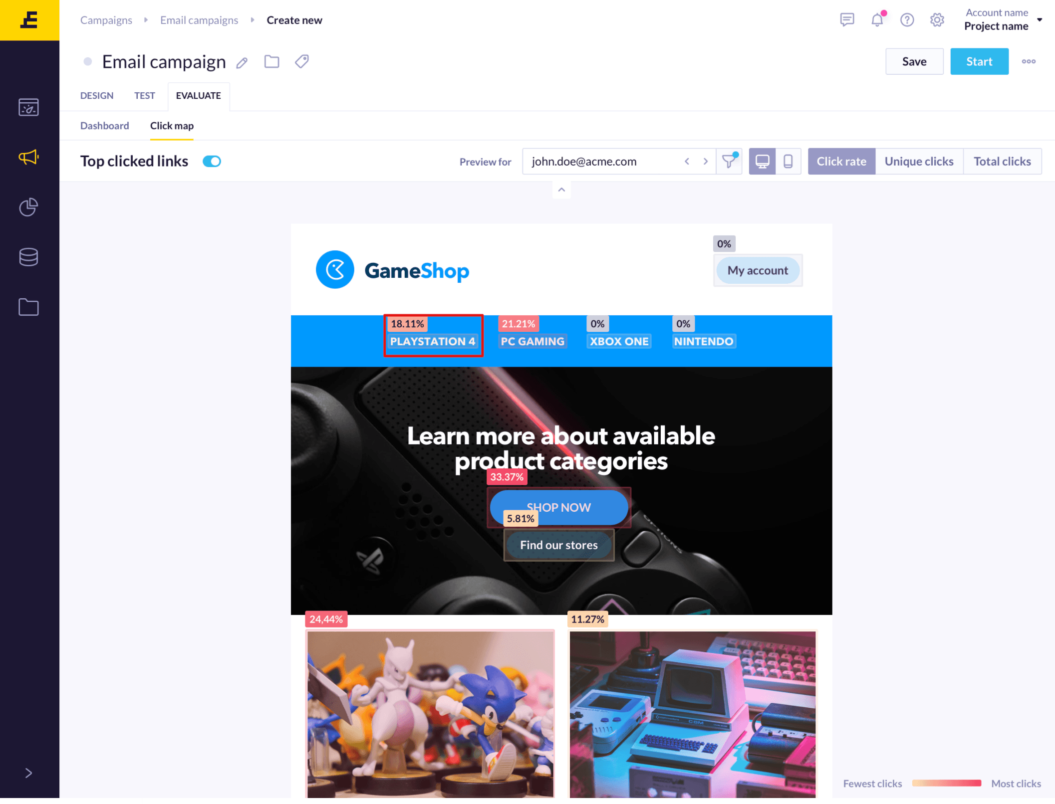


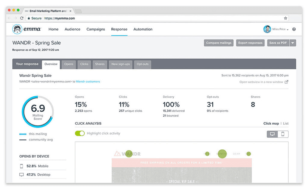
Findings & Insights
Mailchimp provides basic visualizations but lacks real-time interactivity.
Hotjar excels in UX and clarity but is not tailored to email.
Campaign Monitor heatmaps often overwhelm email visuals.
Device segmentation and real-time feedback are gaps Clevertap can fill.
The opportunity lies in simplicity, context preservation, and speed of insights.
Competitive Advantage for CleverTap
Context-aware overlays tailored to email performance
Integrated into existing analytics with minimal learning curve
Mobile + desktop views from the same screen
Real-time data updates for immediate optimization
Heuristic Evaluation
The heuristic evaluation for the click heat mapping feature in Clevertap focused on identifying usability issues based on established principles of user experience design. Below are key findings categorized by common usability heuristics:

Issue: Users may not immediately understand how to interpret heat maps or the metrics displayed.
Recommendation: Incorporate clear legends and tooltips that explain color coding and data points to keep users informed about what they’re viewing.

Issue: Terminology used may be too technical for some marketers who are not data-savvy.
Recommendation: Use familiar language and context, avoiding jargon. For example, replace technical terms like "click-through rate" with simpler alternatives when appropriate.

Issue: Users may feel trapped in a specific view without an easy way to navigate back or reset filters.
Recommendation: Implement clear navigation options and an “undo” feature to allow users to experiment with different views without the fear of losing their original context.

Issue: Inconsistencies in color coding or iconography compared to other analytics features can lead to confusion.
Recommendation: Ensure consistent use of colors, icons, and terminology throughout the platform, adhering to established guidelines for similar analytics tools.

Issue: Users may misinterpret data due to a lack of context or guidance on what certain data points imply.
Recommendation: Provide contextual help or onboarding tips that explain how to analyze heat map data effectively, minimizing the chances of misinterpretation.

Issue: Users may struggle to remember how to access or interpret different features of the heat map.
Recommendation: Create an intuitive layout that emphasizes frequently used features and integrates instructional cues that remind users of available functionalities.

Issue: Advanced users may find the interface too simplified, limiting their ability to delve deeper into analytics.
Recommendation: Include customizable settings or advanced filters for power users, allowing them to tailor the heat map display according to their specific needs.

Issue: A cluttered interface can overwhelm users, making it difficult to focus on key insights.
Recommendation: Adopt a clean, minimalist design that emphasizes essential information and reduces visual noise, ensuring the heat map is the focal point.

Issue: If data loading fails or there’s an error in displaying the heat map, users may not understand the cause.
Recommendation: Implement clear error messages and recovery options, guiding users on how to resolve issues.

Issue: Users may require guidance on how to best utilize the heat mapping feature.
Recommendation: Provide easily accessible help documentation or tutorials that walk users through the functionality and best practices for interpreting the heat maps.
Technical Limitations Identified - Game changer
Final Design Solution


🎯 Key Takeaways
This project wasn't just about designing another feature — it was about balancing user empathy, business goals, and technical realism to create something valuable, feasible, and future-ready.
Impact and Learnings
Positive User Feedback: Marketers found it intuitive, clear, and easy to use.
MVP Delivered on Time: Shipped a working version within tight timelines without sacrificing usability.
Scalability in Mind: Left room for future expansion into richer visualizations once tech infra grows.
Product Mindset: Reinforced the importance of aligning vision, technical feasibility, and user needs early in definition phases.